Wednesday, 28 March 2012

Research Statement and Annotated Bibliography

Neoclassical Design

Book: 
Neoclassicism/David Irwin

This book is a study of Neoclassicism. This could be a useful source of information on Neoclassicism as it, covers it's distinctive style, versatility, scope across art forms and it's influence in different parts of the world. The book also provides a range of illustrations.

Irwin, D. (1997). Neoclassicism / David Irwin.
London: Phaidon Press.

Journal:
Stone World: Modern facility reflects Neoclassical design

This journal entry is about the influence of Neoclassical design in a modern facility in Tennessee, USA. This could be a useful source of information on Neoclassical design as it shows how Neoclassical design still influences modern design with a direct example, detailing what it takes to construct it.

Stinnard,M. (2007). Modern facility reflects
Neoclassical design. Stone World, 24, 156-162.


Edited Book:
Neoclassicism and Romanticism 1750-1850

This book is a collection of sources and documents on Neoclassicism. This could be a useful source of information on Neoclassical design as it has a variety opinions from various historical figures, it also gives a historical background on Neoclassicism.

Eitner, L. (1971). Neoclassicism and Romanticism,
1750-1850. Englewood Cliffs, NJ: Prentice Hall.


Website:
Neoclassicism and America 1750-1900

This website is about Neoclassicism and it's presence in America. This could be a useful source of information as it shows the influence Neoclassical design has had on a country like America, it shows the influence it has had on their architecture and design, such as parliamentary buildings.

Centre for Education Studies. (2010). Neoclassicism and America 1750-1900
[www page], URL http://www.neoclassicism.us/Main/HomePage


Image:
Lincoln Memorial

This is an image of the Lincoln Memorial. This could be a useful source of information as the image is of an American memorial which is heavily influenced by Neoclassical design. Thus it shows the influence of Neoclassicism on American Architecture.


Baxter, A. (2011). Lincoln Memorial,

Tuesday, 27 March 2012

Design Visualisation, Project One

This is my submission of six drawings for my Design Visualisation class for Project One.


Identity

Hatch


Draw

Section


Touch and Draw
For 'touch and draw' above I abstracted the essence of 'keys'. I used the teeth shape of my keys as a starting point to split the drawing into three sections, and give the hint of an abstract landscape, like one that could be unlocked with keys. The top half represents the positive side of keys, as in being able to enter, I have made it open, predominately white. Whilst the bottom half is darker and more closed showing the negative side of keys, being locked out of something in which you don't have the keys for. Then with the centre I have used basic geometric shapes to fill the teeth of the keys such as triangles and semi-circles, to flatten it out showing how keys work, as in the teeth of the keys match the lock, and I have drawn a straight line through to show the path of getting through an unlocked door. Then the numbers at the beginning of the line are numbers which I took from my keys, they represent the numbers before the locks, such as door numbers or mail box numbers.


Individual Work
For my individual work, as above, I used the technical drawing style below as a precedent for a technical drawing of my cellphone.


My precedent drawing has a simple diagrammatic layout, it is universally easy to follow using an obvious annotation style, and keeping the same line weight throughout to reduce confusion. I took this idea in my drawing creating a similar grid giving a simple idea of scale, I also used an identical annotation style, giving the necessary measurements to recreate the image. In terms of additions, I added thicker line weights to the outside of my drawing to distinguish the object from the annotations. I also added a basic three step 'user guide' to emphasis the straight forward style.


Saturday, 24 March 2012

Creative Coding, Project One, Blog Three

I have now created 32 variations of my form, but must now choose the top 24, these will be the images which best show my exploration of the form. I think I will cut some of the images out from series which already show enough evidence of the 'breaking point' of the form.

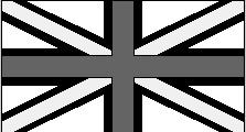
It seems, at a glance that most of these images are just an exact copy of the Union Jack, it's not until you stop and look that you notice the differences due altered parameters, and that they are no longer what we conceive to be a Union Jack.


I think I have explored my form enough. Now I must print out my final 25 and compose them on card. I will then present them.

Friday, 23 March 2012

Creative Coding, Project One, Blog Two

I have completed all the components of my Union Jack, ready for manipulation to start pushing the boundaries of it's form.


In terms of the coding, I used separate variables for each part of the form to give me room to be able to separate them so it is easier to manipulate them, however, in order to move the whole form as one I related each of the separate x and y positions to the main or entire form x and y position. This is shown by part of my code below as I have other x any y positions such as xIV and yIV related to the main x and y variable.  Thus all the parts of the form move together, yet I can still move the separate parts away from the main position by adding or deducting from the original position.

I have also made my form more adaptable by having for example different width variables for each of the two rectangles which make up the plus of the Union Jack, this means I can change the value of one without changing the other so only one part of the plus thickens.


Because of this I was then able to start exploring the boundaries of my form, and that is what I have been doing since.

Firstly I have looked at the width of the top and bottom triangles...

From this experiment I have found that the form becomes lost once the white rectangle can no longer be seen between the triangles and the cross.


This was also the case when I increased the width of one part of the cross as once the white between the triangles and cross are covered the distinct form is lost, however I find it still looks like a Union Jack, just a poorly constructed one. I also looked at the opposite of this, decreasing the width of both crosses, and found that the form is still recognizable due to the strong white outline and presence of the crosses, but it just does not look like a traditional Union Jack.

Decreasing width of crosses
 I will continue to experiment.

Monday, 19 March 2012

Creative Coding, Project One, Blog One


For my first creative coding assignment I have firstly looked at a few possible forms I could use to manipulate. The three ideas I came up with were a triangle, circle and checker board. However I felt as if a triangle has limited possibilities in terms of manipulation, as you can see by my sketches below I have looked at breaking it apart, as well as curving the lines, which is fine but is about all I could do with it... The circle is much the same, here I have warped it, made it not a perfect circle... but that's about all I could do with it. Then there was the checker board which I had ideas of spreading the individual squares all over the place and manipulating their size and shape etc. but I felt that would have been a little boring.


I then looked at doing a star... however that is more or less just two triangles which again isn't very exciting. I did have a go at coding this however...

...this proved to me how visually unappealing it would be as well as limiting as there was not much to adapt.


I then looked at a Union Jack.


I thought this would be an interesting form to explore as it has many different layers to it due to the fact it is made up of a few different flags, meaning there is room to explore. 

As shown by the sketches above I'm looking at breaking apart and rearranging the layers of the Union Jack to see if it is still recognisable. I will also look at playing with size, making it bigger and smaller, and doing this to separate layers while the rest remain the same. I will also look at skewing sections of it etc.

As shown above I sketched up a Union Jack and jotted down the co-ordinates of each point for each line, then I used this to code it on processing. This was a long and tedious task.
After spending about two hours coding this I then came to realise that there really wasn't much I could do with this in the fact that I had used numbers in my coding with no variables, so in order to change anything I would have to go and change every individual co-ordinate which would be ridiculous...

...HOWEVER today I think this whole idea of coding clicked in my head and I think I get it now... Today when I re-coded it I used variables and actually looked at the relationships between different points etc. So now I can easily manipulate it by simply changing a variable. 

So far today I have managed to make the cross and plus symbol of my form, I also learnt how to create a shape out of the lines so I can fill the separate layers making it more visually appealing.

Here's what I've got so far...


This is the two shapes I made to day combined + the rectangle backdrop.

Here's the cross by itself, with backdrop

Here's the plus layer by itself, with backdrop

Here are some of my variables for my shapes,  it's my own little language

Here are my variables at work, representing the position of a co-ordinate in terms of another.
Here's an example of what I mean by easily being able to change variables to alter the form.