Showing posts with label #DSDN101. Show all posts

Sunday, 17 June 2012

Design Visualisation, Project Three, Blog Nine

I have now completed all of my editing and here is my FINAL CLIP...


Overall I think my clip has come out fairly exact to my original storyboarded plan. I think the message is fairly clear also however I'm not entirely sure whether the last shot of the wallet necessarily gives the idea that it influences consumer spending but I think even if the viewer doesn't make that connection I think the overall idea that different media provide a way for consumers to be bombarded with advertisements.

In terms of my editing choices I had to cut a lot of things down, I didn't take anything out it was more just a matter of trimming what I had down to make it concise and to the point.

For my soundtrack, I went with a slightly different idea than I originally thought. I originally was going to go with a very dark, and spooky soundtrack to make it seem like a very evil invasion. However in the end I settled on a soundtrack which more emphasizes the idea that advertising is something that can spread quite quickly through the use of media, and that it happens often without a consumer even realising it. I achieved this by first using 'un-occupied room' ambience, such as the ticking clock noise, to suggest that there is no one in the room or paying attention to what is going on. Then I used the computer start up sound to show firstly that the computer has been turned on and secondly to suggest the beginning of the invasion, as often these days the internet is a place where viral campaigns can start. Then I used a fast paced 'rushed' sounding track to emphasise the speed in which campaigns can spread. I then have the music cut off once the hand comes into shot and when the labels have all hidden in the wallet to suggest that this has all happened behind the consumers back, I also contrast the previous track with again the room ambience and clock sound to make it seem like nothing had gone on at all.

In terms of the lighting I decided to brighten up the footage over all as the lighting was fairly dim, I also added a slight blue tint in order to make it look less red.

Overall I am very disappointed with the video quality of this clip, I found that once I exported the clip from iMovie the quality reduced greatly and it is just as grainy if not more than my interim video, which is really disappointing after going to all that effort. But looking past the bad video quality I think it achieves what I set out to achieve.

'Media design provides a way to bombard consumers with advertisements in a variety of ways'


Soundtrack References:


Subway Sandwich Wrapper - bsung88 Retrieved from http://www.freesound.org/people/bsung88/sounds/79136/


Clock - Pogotron Retrieved from http://www.freesound.org/people/Pogotron/sounds/60811/


MouthPop - Herbert Boland Retrieved from http://www.freesound.org/people/HerbertBoland/sounds/33369/


Flurry - Apple Inc.


Mac Chime - Apple Inc.

Design Visualisation, Project Three, Blog Eight

After getting to the point I was for my interim presentation I have since re-shot everything in order to try get an overall better quality clip. I decided to use a better quality camera, I also used a tripod so my image sequences are more steady, as previously I was using a cellphone with no tripod so it was very shaky.

Below is part of the new footage I have taken...
I think this footage is pretty good quality, it is steady and it's not too grainy, however the images have already lost a bit of quality in the process of putting them together. I'm not that pleased with the lighting as I found I had to film during the night, as during the day the light changes too much, due to clouds and time of day...etc. However doing it at night with just the room lights on makes every thing look very orange, but this is something I'm going to have to put up with and something I can alter using iMovie.

I have now been having problems using the software 'framebyframe' (a basic software used for collating and organising images together into a stop motion video). Since I have now been using a better camera my images have a larger file size which has made it harder for 'framebyframe' to export them into .mov files which I then edit in iMovie. Thus I have been having to import then export fewer images at a time, at the length of the clip above. This has extended the time I have had to take working on this project.

In terms of re-shooting my clip I firstly decided to digitally draw my 'Kraca-Kola' logo on the computer to make it look more legit as I want it to look like a real label made by a large company.

I also reworked a lot of camera shots in order to make my story more clear condensed. In the beginning I decided to have the screwed up advert outside of the rubbish bin in order to save time, so I didn't have to have an extra shot over the top of the bin and then have it crawl out. I think it now still achieves the idea that it is a piece of rubbish which is supposed to be in the bin, which in the end shows that even though the consumer thought they had thrown away this flier they have still been exposed to it and thus when they see the ad again on different media they will recognise it, and be more likely to purchase the product. I also changed how the paper moved, I decided to not have it compress like a caterpillar and just slide around instead, even though I liked this original movement I found it too fiddly to pull off as it would often fall out of place and it was hard to keep it a consistent movement. Also they can now move faster and smoother with just a slide motion keeping the clip concise.

Another shot I changed was where the paper climbs up to the top of the desk and enters the CD drive of the laptop. Before I had a shot of it reach the top then it went a shot of the laptop, then a shot of the advert entering the drive. I found this was very confusing especially as the CD drive is on the opposite side to the side of the desk the paper came from. So i decided to make this more clear by having the camera pan. Now I have the advert climb up, slide over the top of the keyboard and down facing the CD drive, this is all followed by the camera using a pan shot. I then have a closeup as I did before of the ad entering the drive.

I also added a wide shot just before the final wallet shot. I decided a wide shot was necessary to give an overall view of the desk and what the invasion of this 'Kraca-Kola' had covered, so the viewer could get the idea of the context, being someones personal desk in their room. This is an important idea in my clip as it shows advertising is able to bombard you in your very home through the use of media.

Otherwise everything else has remained similar, and I now have to collate and edit all the separate clips in iMovie.

Friday, 8 June 2012

Design Visualisation, Project Three, Blog Seven

I have slowly been working through each part of my clip and have put together what I have so far for an interim presentation, here it is...
 I'm not sure whether I will keep any of this as I think I might try use a better quality camera as this clip isn't particularly good quality as I have been using my cellphone camera with no tripod. However in terms of this clip I think there is a lot of editing which could be done on what I have so far, trimming down bits, whilst adding a bit more to other bits. Also with the lighting effects I have used in this I think they could use tweakings too as they make the quality of the pictures worse looking.

I think using more moving camera shots then still shots will also help with the pacing of this clip, such as the movement I have in the opening shot where the camera tilts upwards.

Saturday, 2 June 2012

Design Visualisation, Project Three, Blog Six


'Media design provides a way to bombard consumers with advertisements in a variety of ways'

“90% of all products introduced into the marketplace are pulled within 24 months. Most of them failed because most buyers never heard about them”(Austin, 1999). This statistic shows that it is important for a product to have consumer awareness for it to be successful/profitable and thus in order to achieve this advertising needs to be used. Additionally to gain a greater level of consumer awareness multiple types of media are often used for single campaigns.

Today there are many different types of media available to advertisers. There are the older types of media such as print media, billboards, magazines, newspapers and now modern digital media such as the internet, television etc. Thus consumers are now bombarded with advertisements almost everywhere they look. It is particularly bad now with the internet, as soon as you enter a website suddenly multiple pop-ups appear bombarding you with product advertisements. According to inc.com a recent report has found that digital advertising is “excessive”(2012). However they believe it could cause a major “backlash” from consumers as they dislike the constant bombardment.

Advertising is also presented more subtly as well. An example of this is product placement which is becoming more and more common in things such as music videos and films.
(Product Placement, 2012)
Above is an example of Coca-Cola placing their 'Diet Coke' cans in Lady Gaga's hair in a music video.

Again this is another way consumers are bombarded, creating further awareness of a product, thus making it more likely for them to notice it and purchase it.

In my clip I am wanting to show this idea of bombardment by having an advert spread itself as if a virus across multiple media in order to gain consumer attention. I want to set it in a bedroom making it seem more of a personal invasion, invading privacy to gain a consumer's attention, which I believe advertisements do.

References:

Austin, G. (1999). High Impact: How you can create advertising that sells!. Retrieved from http://www.marketingpsychology.com/advertisingbook.pdf

Sherman, E. (2012). Advertising Overload: Are you guilty?. Retrieved from http://www.inc.com/erik-sherman/are-you-guilty-online-advertising-overload.html

Product Placement. (2012). Retrieved from http://megsinfinitepossibilities.blogspot.co.nz/2012/03/product-placement.html

Thursday, 31 May 2012

Design Visualisation, Project Three, Blog Five

I have now completed my storyboard...
I ended up breaking away from using traditional squares and instead tried to show my clip as one images. I attempted to use the 'Kraca-Kola' advert as a means of showing the direction of the story/clip in the storyboard.

I also decided to use a made up soda brand for my advertisement named 'Kraca-Kola'. This brand is based on a dominant existing brand. I decided to do this as I thought that the soda/softdrink/juice industry is a very competitive industry with this one dominant brand, and this is what I wanted to show, how dominant and aggressive advertising is in order to gain consumer attention to influence their spending. In my clip as shown in my storyboard I plan to have the dominant brand 'Kraca-Kola' cover up it's inferior rival 'Lepsi', showing the competition there is to gain attention over each other and ultimately gain sales.

I have also made a little test clip, attempting to create the first few seconds of the clip.
I found I made a fair few mistakes in this clip such as not realising my leg was in a few of the shots as well as other things. Also moving the advert within the rubbish bin proved difficult as it was hard to make it stay in the place I wanted it and hard to not knock the other bits of rubbish out of place. Also of course with using my cellphone camera it is hard to keep it still creating a very shaky picture, however when I film my final I will use a better quality camera and have a tripod to keep it steady.

I have also had a go at looking at the lighting effects I would use, I edited the previous clip in iMovie...

I used a greater contrast and a blueish tint, to create a slightly ominous picture, as I want to portray advertising as a 'bad' invasion.

Sunday, 27 May 2012

Design Visualistaion, Project Three, Group Assignment Two


Nana technology aims to facilitate the technologically challenged in becoming savvy and up to date in their communications. They offer social networking tutorials and have developed a series of app's for senile geriatrics. Our advertisement aims to attract interest from our target clientele by displaying relevant aesthetic and media. Appropriately clear in meaning and product, for an elderly audience with failing eyesight and hearing. An audio sample from the wizard of OZ soundtrack, which is easily recognisable to our audience, aims to be attention grabbing through its sense of nostalgia. Our slogan ‘making it easier to connect’ simply states the purpose of our range of services, literally making it easier to understand what we provide.
Within our animation, we depicted a nana confused by technology. This relates to the struggles that the elderly face. When “Nana Technology” appears her problems are solved. Showing that our company can help the elderly find joy in technology.
We used the same visual features in both the TV commercial and the poster so our audience can recognise our company in both medias.


Images of Nana retrieved from http://www.123rf.com/photo_2866853_senior-woman-using-cell-phone.html
Signed Brief

Monday, 21 May 2012

Design Visualisation, Project Three, Blog Four

I have decided to change my storyboard slightly now I want to start it with the flyer/poster screwed up in the rubbish, then it unscrews-up itself and continues the things it did in the previous storyboard. I decided to do this as it shows that even when you think you have disposed of an ad or 'put it to the side', it still has an effect on you as if you see that ad again perhaps in another form of media or the product you will recognise the brand.

I also made a test clip of a piece of paper 'unscrewing-up' itself.

I am also currently reworking my storyboard in a less conventional way, breaking away from squares.

I found a few examples of storyboards with protrude the set squares which I thought was interesting and perhaps a feature I could have in my storyboard. Such as this one...
 I think this really helps show what the action is like for this shot by having the images come out of the frame.

Sunday, 20 May 2012

Design Visualisation, Project Three, Blog Three

I have now decided on an idea for my stop motion clip out of what I have brainstormed. I have decided to go with the idea of how advertising covers a wide range of media in order to get consumer attention. So far I have made a storyboard for it which involves a poster on a wall destroying another poster next to it to show the competition with advertising, the poster then enters a laptop,appearing on the screen, it enters a cellphone, radio, covers a bottle logo then enters a wallet, the wallet is then picked up by its owner, suggesting the influence that ad will have on that consumers spending.

I have also had a few attempts at making some stop motion clips. I have been using the camera on my cellphone so keeping it steady has proved difficult and these clips are pretty shaky. But I think the motion of some of the objects in these clips is ok, I think I will have my frame rate at 12fps as these clips are, any less than this I think is not smooth enough, but anymore will be too much of a mission with photo numbers.
For the clip above one thing that doesn't work and that I will have to consider when doing my final clip is the light reflection in the poster in the background, I will have to make sure I am in a space where I can control lighting.
This clip is really shaky because I was just holding the camera for a lot of it. When I do the real clip I'll make sure I use a tripod.

Wednesday, 16 May 2012

Design Visualisation, Project Three, Blog Two

Taking what we thought up in our group brainstorm, I then looked at my own project in particular how I could relate my minor, Marketing into that.

I started by getting the definition of marketing as a starting point...

Marketing - The action of promoting and selling products or services.

My first thought was to look at old media versus new media as we did in the group brainstorm, except for me to give it a marketing twist. I thought it could be interesting to show how advertising has had to adapt to cover new media, such as digital media.

I thought for this idea I could have an advertisement in the form of a flyer, which is fairly plain. The flyer would then find its way to the scanner and scan itself to the computer where it would digitally remaster itself with colour etc (maybe the character from the advert would do this on the computer much like the stickman in the video I put on my previous blog post). The new looking digital ad would then upload itself to Facebook or email itself to others.

My second idea would be much like the first but instead of just changing from print to digital media, the advert could cross multiple different types of media such as television, internet, print etc. This would show how advertising covers multiple media. I could have a person looking across his room at different media devices and each time he looks at a different one the advert 'jumps into' it, adapting to that technology.

For my third idea I thought about portraying advertising as a virus/invasion as it spreads everywhere. I thought I could start with a forest which is slowly invaded by advertisements. I thought this could look at the idea of 'commercial clutter', destroying pure/plain/untouched surfaces with advertisements, and by using a forest it would exaggerate this.

Here is the kind of idea I am thinking of, except instead of a vine growing it would be advertisements.


I also looked at this subliminal idea of constant exposure to advertising, such as product placement in things like music videos, movies and TV shows.

Product placement is becoming more and more common these days, here are a few examples...
This is a fairly obvious example of the 'CocaCola' cups used by the judges on 'American Idol'.
The Mini has made many appearances in music videos such as this Bruno Mars one.

This is a slightly more subtle one for 'Diet Coke' in one of Lady Gaga's music videos.

 In the end what most of this subliminal advertising comes down to get consumers to buy the product. So I thought it could be an interesting idea to have logos on products found in someones room to turn into a 'Buy me' logo which would then detach from the product and find it's way into a consumers wallet, showing 'a new way of seeing' brand advertising.

In terms of possible stop motion precedent videos that are relevant to what I am doing, I found this ebay commercial which creates a 'hand drawn' computer, I thought this is an interesting concept as simplifies the idea of digital media into basic pen and paper drawings.


Sunday, 13 May 2012

Design Visualisation, Project Three, Blog One

To make a start to project three, a stop motion clip, we starting brainstorming ideas as a group on media design, with the concept 'a new way of seeing'.

Our initial brainstorm
We first looked at having reality collide with the digital world, such as having an image on the screen which comes out of the screen and into the real world. Alternatively we thought that we could even have a drawing leave the page of a sketch pad and 'jump into' a computer screen, perhaps trashing the computer desktop showing this whole idea of older media versus new media.

This is the kind of thing we were thinking of in terms a drawing attacking a computer...
Another idea we looked at was graffiti art. Having graffiti/taggings come to life. In which we could explore a 'new way of seeing' graffiti, portraying it as something that just keeps being re-done even when a lot of effort goes into getting it removed.

I think this video is a great example of our idea as it shows ever evolving wall art...

The other main idea we looked at was the evolution of media from the days of using fax, wired telephones, older cameras etc. While now days only needing one device in the form of something like a smart phone.

We then looked at the smart phone and all its capacities, looking specifically at the media devices it has replaced from the past.

We then came up with a simple storyboard with the idea of having a newspaper with the news and a letter with mail flying through the air and being grabbed by someone who puts them in their pocket. They then see something the like putting their fingers around it as you do when lining up a camera shot and it then takes a photo which they place in their pocket. They then reach into their pocket, pull out a smart phone and flick through their mail, news and images. Our intention with this idea is that it would show this whole idea of the new way of seeing media, which is mainly digital these days, and a lot of it can be found in a pocket sized device.


A video we found that was very similar to this idea was an old vodafone advert, here it is on YouTube...


Sunday, 6 May 2012

Design Visualisation, Project Two, Blog Seven

http://www.youtube.com/watch?v=07B9eGBL2AI


This is the link to my final, final hand-in clip.

After coming into hand in my previous video I made sure it was ready by getting some last minute feedback.

It became apparent that in the beginning of the clip when the e first sees the r, this was confusing as when the shot changes from light to dark the position of the e is different making it hard to recognise that it is still the e. So in order to quickly fix this I decided to remove the e from the dark shot where the e appears, I also increased the length of the gasp sound effect so it goes across both shots aiding the transition.

Another change I made was during the sequence where the e falls off the U and hits the ground muliple times. During this I had the r appear in the dark flashes. However this proved uneffective so I decided to remove the r approaching in the background.

For this project as I mentioned in my previous post all of the sound effects I used were not done by me, here is a reference list of all my sound effects...

Drone Dark Suspense 02.mp3 - Apple Inc. - Sourced from MacBook Pro comes with MacOSX Lion

Gasp - room - Sourced from http://www.freesound.org/people/room/sounds/7407/

Evil Laugh - klankbeeld - Sourced from http://www.freesound.org/people/klankbeeld/sounds/133674/

Scream - thanvannispen - Sourced from http://www.freesound.org/people/thanvannispen/sounds/9432/

Chase Music - sepal - http://www.freesound.org/people/sepal/sounds/120091/

Reverse Clang - bristolstories - Sourced from http://www.freesound.org/people/BristolStories/sounds/65915/

Window Thump - bristolstories - Sourced from
http://www.freesound.org/people/BristolStories/sounds/46136/

Thunder and Rain - Tomlija - Sourced from http://www.freesound.org/people/Tomlija/sounds/99194/

Door Slam - HerbertBoland - Sourced from http://www.freesound.org/people/HerbertBoland/sounds/46076/

Squish Sound - Sourced from http://soundbible.com/828-Blood-Squirt.html

Sword Slice - Black Snow - http://www.freesound.org/people/Black%20Snow/sounds/109426/

Low-d-arh - annannienann - Sourced from http://www.freesound.org/people/annannienann/sounds/8067/

Swoosh - Sourced from http://soundbible.com/suggest.php?q=swoosh&x=0&y=0

End Music - klankbeeld - Sourced from http://www.freesound.org/people/klankbeeld/sounds/149865/


Saturday, 5 May 2012

Design Visualisation, Project Two, Blog Six

This is the final clip.

In terms of looking back at the storyboard I made for it I have made quite a few changes...
Firstly when beginning the animation, drawing the 'e' for each of the views I decided to only have two different coloured variations, being the black model with white outline, when the background is black and  black with white 'belly' when the background is white.
White Background 'e'

White Background 'e'

Black Background 'e'
I did this as the colour scheme I had in the storyboard was confusing and unnecessary. 

Another thing I did not do which I had in my storyboard was making my 'r' grow and shrink as he laughed, a sort of chuckling movement. I found this would have been unnecessary as having the 'r' become taller in those shots showed its authority/dominance and I think making him chuckle would have been an unnecessary detail which would have only humanised it which this project wasn't about.

Also the recent changes I made after the preview session which I mentioned in my last blog changed it a bit from the original storyboard.

Another edit I made from the storyboard is the last shot. I decided to make it a slow zoom out from the 'd' to 'MUrdeR' as it fitted it better I believe as after the e is killed the action level has dropped so it did not need a violent zoom out, only a slower more conclusive zoom which slowly gives away my word.

I think all these changes have been necessary and effective in helping to better convey my word and keep my project within the assessment criteria.

One thing I did which kept my clip close to my storyboard was create my own typeface. I did this firstly so I could use different camera angles without having  a flat image, this was important with trying to convey murder, as in order to show the horror of murder I wanted to use high angles to show vulnerability, and low angle shots to show power and dominance and I don't think this would have been as successful using a flat preexisting typeface then just using the 3D tool to rotate it along the x axis as you would be left with an obviously flat image, which takes away any illusion of true depth. Another reason I used my own typeface was because it was exactly what I wanted, I wanted something with sharp edges to insinuate danger to help convey Murder.

In terms of my audio for my clip, all of it was sourced from freesound.org and soundbible.com, I think the sound I have found fits well with my word and helps convey the meaning of it as it creates a horror atmosphere which is generally associated with murder.

Thursday, 3 May 2012

Design Visualisation, Project Two, Blog Five

Above is my first draft of my 'Murder' movie clip. After showing it in class today the main feedback I got was that I had humanised or characterised my letters too much, such as the e having an eye with eyelids etc. Also I found that in the part where my e falls unconcious this was generally lost on the audience as it created confusion as when it goes black most people thought that was the end.

So I have made an edit. In my second go I have removed the eye from my e, and in order to show the emotion his eye showed I have attempted to show this by further excentuating the e's movement, such as making it jump+expand when it gets a fright or shrink when it cowers. Another edit I have made is the removal of the e becoming unconcious in order to remove confusion and keep the clip slick and to the point. Now I have the e fall from the u hit the ground but as the lighting flashes white to black you can see the r gradually approaching the e. This will hopefully add to the horror idea which is generally associated with Murder. Then once the e stops he is murdered instantly.


For now I think I am happy with this but in order to gain some more feedback I'm going to upload it up on facebook.

Tuesday, 1 May 2012

Design Visualisation, Project Two, Blog Four

I decided 'Murder' will hopefully be the more successful option, so I got onto Flash and have since animated my 'Murder' clip. So far I think it has visually turned out ok, it's pretty close to my storyboard, I haven't really had to adjust much from my storyboard which has been good. However I have had my share of problems. Firstly I did not realise I had my frame rate at 24fps until I got half way through, I then switched it to 12fps so presently the first half of my animation is in slow motion so that is something I will have to go back and edit. Also now working at 12fps it's very hard to get nice smooth motion, after working at 24fps it is very different.

Another thing I am having trouble with is this whole animation layers thing. I don't know how to stop the shape tweening I have done on a layer to stop from looping, and how to control when it happens and doesn't happed throughout the animation. So far in order to combat this I've ended up having to male multiple versions of each drawing that uses shape tween so I have one which doesn't morph and one that does. Also I find this animation layers idea very difficult as when I am in the scene timeline I can't see the effect of the shape tween on a drawing layer.

The next step is now to go back on what I have completed and start editing the motion to try create a smooth and fluid looking clip. This will involve using the moition editor which I am hoping is easy to use and willl hopefully not take too long. Once I have done that I will then begin adding sound which I think will be the crucial element in this clips success. If I don't think it works in the end my back up plan is to do 'Sneeze' instead as I think that could also be successful and I don't think it will take too long to make, plus there is only one or two sound effects needed.

In terms of problems I have solved, I have discoverd how to conect pencil lines, there is a button in which you activate this feature with. I have also learnt how to use the the pen tool better to get the curvature I want and how to further manipulate this with the selection and curvature tool.

Here's a tutorial I used to help me with the 'Pen Tool' properly...

Saturday, 28 April 2012

Design Visualisation, Project Two, Blog Three

I have now just finished reworking and brainstorming my storyboards. Here are my new, reworked ideas...


After re-brainstorming I had another think about my final three and decided that 'Organise' wasn't a particularly strong option as it is fairly plain and unexciting, there is no particular surprise with it and it is more or less multiple average word clips within one clip making it un-original. 

I still think my 'Elevator' and 'Murder' ideas are still strong options, however, I have re-worked their storyboards. For elevator I decided it would be more interesting if an establishing shot was not shown until right at the end, so the word is not given away. I also looked at changing the typography of different letters to show different personalities.


For 'Murder' I decided not to just keep one shot the whole and instead use a range of different shots, including low and high angles to add to tension and add depth creating a more rich and interesting world (hopefully). I have also looked at changing the lighting (Black and White). In moments where the bad guy appears, the shot is mainly black, while when the victim is in the clear or escaping it is generally lighter.


To replace 'Organise', I thought my sneeze idea was stronger. What I like about this idea as that, like 'Murder', I would look at using different camera angles, such as birds eye, and face-on, which would hopefully create depth. What I also like about this idea is it is relatively simple and to the point. I think this clip would probably be the most clear at showing its meaning, however it is certainly not the most exciting.


Out of these three ideas I am leaning more towards 'Murder' as I think it is the most interesting, and I think it would be entertaining to watch if I pulled it off. I also like the idea as I think the shots alone would show the general story without sound. However, sound will be a very crucial element of this clip and I think this will determine its true success.


In terms of learning Flash I have been having a further play around learning basic maneuvers...


I have now learnt the difference between Classic Tweens and Motion Tweens. I think Motion Tweens will be most useful for me as they make easing in and out of motion much easier to do. I have also learnt how to shape tween and I now understand this whole separate timelines thing a little bit more now too, animating a symbol then having it do something else at the same time on the scene timeline etc. I am also trying to come to terms with the drawing tools, this is proving very frustrating at times, I am finding it hard to get the exact curvature of lines I want and also how to connect pencil lines, also how to control the thickness and thinness of a single brushstroke... Things to learn.

Tuesday, 17 April 2012

Design Visualisation, Project Two, Blog Two

I have now chosen the three ideas I think will be most successful out of the eight I brainstormed. I have taken, 'Murder', 'Organise' and 'Elevator', and created a one page storyboard for each.

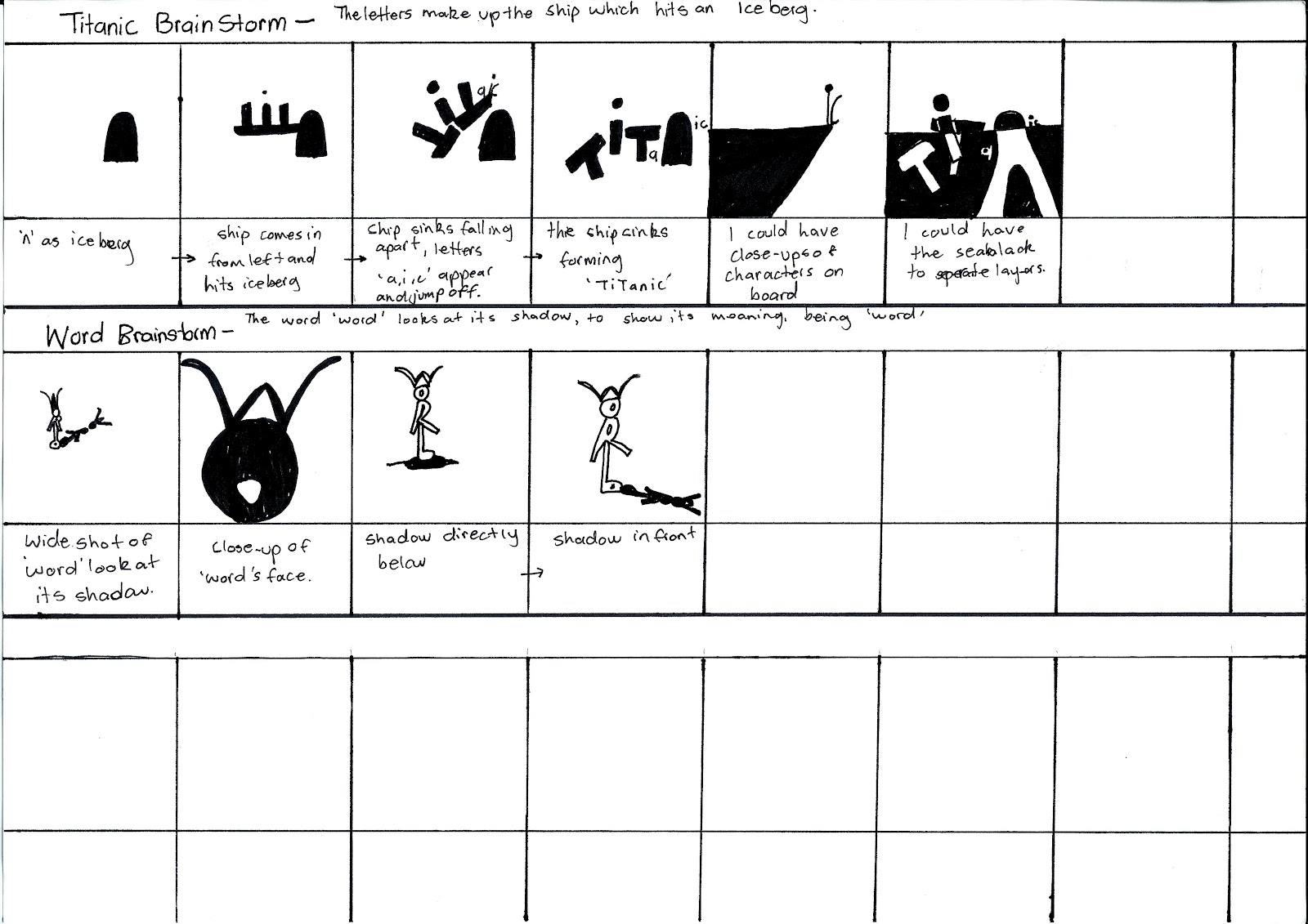
This is my brainstorm with my original 8 ideas.

This is my storyboard for 'Murder', this seems as if it may be successful, however I am wondering whether it would be better to use more than just a long shot the whole time to make it more interesting, and create more horror which is associated with murder, although this could possibly over complicate it.

This is my storyboard for 'Organise', again this could be successful, however what I am concerned about is that it is almost multiple projects in one as it shows the meaning in multiple words such as 'rise' 'sag' etc whilst organising itself, I'm wondering whether this over complicates it taking it away from what it is, 'organise', or whether it enhances it.

This is my storyboard for 'Elevator', I think this is my personal favorite, however I am concerned that this clip may focus too heavily on the narrative of the characterised letters, not enough on the actual letters. For this clip, unlike 'Murder', I decided not to just keep it on a wide/long shot instead to have mid-shots/close-ups to help the narrative and explain the elevator function, I am not sure whether this will be successful or not.
 Now I must decide on my final storyboard and begin to create using Flash.

Friday, 13 April 2012

Design Visualisation, Project Two, Blog One

I have done a rough brainstorm of a few ideas of possible words I could animate...


In the mean time I have been learning the basics of Adobe Flash. I've found so far that coming from using a different animation software I am finding the interface particularly confusing, however it's more or less the same thing.

Here's a little clip I made while learning some pretty basic maneuvers...
I've learnt so far how to make things move, and how to manipulate the movement, I also know how to morph drawings but I'm not sure how to edit morphs, I'm not sure whether there is a 'hint' tool or not... Once I decide on my final clip idea I will then know exactly what I will need to know how to do with the software.

Tuesday, 27 March 2012

Design Visualisation, Project One

This is my submission of six drawings for my Design Visualisation class for Project One.


Identity

Hatch


Draw

Section


Touch and Draw
For 'touch and draw' above I abstracted the essence of 'keys'. I used the teeth shape of my keys as a starting point to split the drawing into three sections, and give the hint of an abstract landscape, like one that could be unlocked with keys. The top half represents the positive side of keys, as in being able to enter, I have made it open, predominately white. Whilst the bottom half is darker and more closed showing the negative side of keys, being locked out of something in which you don't have the keys for. Then with the centre I have used basic geometric shapes to fill the teeth of the keys such as triangles and semi-circles, to flatten it out showing how keys work, as in the teeth of the keys match the lock, and I have drawn a straight line through to show the path of getting through an unlocked door. Then the numbers at the beginning of the line are numbers which I took from my keys, they represent the numbers before the locks, such as door numbers or mail box numbers.


Individual Work
For my individual work, as above, I used the technical drawing style below as a precedent for a technical drawing of my cellphone.


My precedent drawing has a simple diagrammatic layout, it is universally easy to follow using an obvious annotation style, and keeping the same line weight throughout to reduce confusion. I took this idea in my drawing creating a similar grid giving a simple idea of scale, I also used an identical annotation style, giving the necessary measurements to recreate the image. In terms of additions, I added thicker line weights to the outside of my drawing to distinguish the object from the annotations. I also added a basic three step 'user guide' to emphasis the straight forward style.


Wednesday, 7 March 2012

Helvetica

"...a designer choosing typefaces is essentially a casting director." - Tobias Frere-Jones


A quote from the documentary about the typeface (font) Helvetica.