Showing posts with label #Project2. Show all posts

Saturday, 20 October 2012

Interaction Design, Project Two, Blog Sixteen

Project Two Complete!

I have now completed the final video for my navigation application. Here it is...
I have added music more or less throughout the entire clip in order to keep the flow and keep it alive. The music changes a lot to suit the different clips and add to the quick swipe, changes.

I have also edited some of the clips in order to make Arrown seem more alive through animation, and I also changed the "KELBURN CAMPUS" map clip. I now have the map warp fading into a red tint making it seem scary and hard to navigate around.


I feel like this video represents my actual application fairly accurately, not in a screenshot/user guide way, but it represents the tone and general aesthetic. I have also generally stuck to my storyboard with the addition of a few things, such as a 6-pack of beer with a face, and many other gags which will hopefully be a little bit funny or at least make someone smile. I also changed some transitions in order to keep the fluidity. One thing however that has taken away from the fluidity a bit are the little comments between Arrown and the offstage hand guy, however I found it adds to the kind of humour so I wasn't willing to remove them, as the clip needs a balance of both.

The changes that I have made including Arrown's voice and personality, and the addition of real life images I would want to carry over into the application if I were to keep developing it as I feel they would make it more fun and light. Also I think I would incorporate a background soundtrack in my application to keep it alive.

Interaction Design, Project Two, Blog Fifteen

I have continued to work through my video and I'm almost at the end of animating. I have noticed that I have forgotten to animate Arrown properly when he is first seen in the chair at the beginning as he is completely static, so that is something I will go back and redo. I have noticed that as I go I am finding better ways to bring Arrown to life through animation, and I think this is showing in the clip. One very simple thing that I think brings him to life is blinking. It's a very simple thing but it makes him seem way more alive.

Here's what I have so far...

Another thing I am going to redo is the map of Kelburn when Arrown says "KELBURN CAMPUS". At the moment it is pretty average as I just added it in using iMovie, instead I think I will animate it somehow in Flash.

After all the animation is complete I will then need to start looking at sound. I think I'm going to add a music track underneath the whole thing, as it needs a bit of a boost due to the fact there a quite long parts with Arrown just talking with not a lot else going on where the clip kind of dies.

Friday, 19 October 2012

Interaction Design, Project Two, Blog Fourteen

I am currently working on animating my promotional video for my find: Navigation Application. I have decided to animate it piece by piece, exporting it piece by piece as I find when using Flash big projects can get very messy and confusing in flash. 

In term of the application I have developed Arrown's character more. He is no longer English but now a New Zealand modern day Maori. I did this as this makes him more relatable to users as they are going to be staff and students of Victoria University, which are mostly New Zealanders. His personality now is also very Kiwi, he is now very laid back.
The above video is what I have so far. I have combined my current progress and added some sound in Flash.

Sunday, 14 October 2012

Interaction Design, Project Two, Blog Thirteen

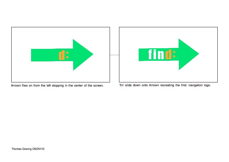
I have made a storyboard for my video clip about my navigation application. I have decided to make it a promotional video which is completely animated. I have decided to do this as it better suits the cartoonish style of the application, and since my application isn't particularly that hard to use it doesn't really need to have a direct representation of how to use it. This video will more give the user an idea of what to expect interms of the aesthetic and general tone.
Below are the larger original images from the storyboard...


Sunday, 7 October 2012

Interaction Design, Project Two, Blog Twelve

User testing of my navigation application:

1. Learnability - Users found it was easy to accomplish basic tasks due to the thorough descriptions given by Arrown.

2. Efficiency - This seemed to be my applications downfall, as Arrown was often too talkative and needed to get to the point more quickly.

3. Memorability - Users found the application easy to remember.

4. Errors - There were a few errors but these were due to the limitations of the mock version of the application.

5. Satisfaction - Users said they would have found it more satisfying if Arrown talked less.

Thursday, 4 October 2012

Interaction Design, Project Two, Blog Eleven


My applications is now complete...


Navigation Application

The find: Navigation Application is centered around the two dimensional arrow character named Arrown. Arrown makes up everything in the application form the directional arrow to the search bar. The point of this application is to make it as if the user has a pocket sized personal tour guide, except unlike most navigational systems Arrown is very characterised with a unique personality creating a more enjoyable experience, in addition the application has a simple aesthetic so it is easy to use.

Features:

  • Accurately tracks users position inside interiors, giving detailed directions by explaining using visual features along the way, “Go towards the pot plant”, and through actual directions, “Turn left”. In addition Arrown also points out the way with his arrow head, which adjusts relative to how you are holding your phone, to ensure the arrow is pointing exactly where it is.
  • The user is able to get directions without looking at their phone due to in-depth oral instructions meaning they can find where they are going without the social embarrassment.
  • A map is available for the user to look at so they can get a general overview of where they wish to head.
  • The music option takes the user to there music which will then become quiet when the user is heading in the wrong direction


Wednesday, 3 October 2012

Interaction Design, Project Two, Blog Ten

I have now finished creating my application in Flash, however in doing this I had to change some of my ideas in order to make it work.

The main problem I had was with the embedded timeline feature in Flash. I could not find out how to have one button on one timeline which when clicked would activate something on another. In trying to work around this I ended up having a very complex and messy layout which I struggled to navigate through. Therefore I decided to try keep most things on one timeline which meant having multiple copies of Arrown for each animation. In doing this however I now don't have Arrown transform into the search bar etc and instead he flies off and then back on as the search bar and so on. Even though this goes away from what I originally wanted, I feel that this creates a better flow for the app and suits the motion of Arrown the arrow.

One thing I found useful along the way when scripting was the code snippets tool, this made things very simple which was helpful.

In terms of Arrown's voice, I decided to do an almost Cockney accent and have him as a somewhat nervy character who can also be quite condescending. He's a bit of an unlikely hero.

Another thing I have looked at is colour. Overall the main idea was to go with green, as it symbolises 'go' and then he turns red when the user should turn around as it symbolises 'stop' or 'wrong way'. I then believed both green and orange and red and orange go well together, orange is also the third colour in the traffic light so it seems to fit quite nicely. However some people have disliked the colour scheme so I have tried to alter it. I have looked at having a darker shade of green but it does not look right, I also tried changing the orange to yellow but this was not successful either. I think one of the main problems is that when using the app on a laptop screen it makes the plain white gradient background too overpowering. I think that when the app is on a phone it will look better.

For the interim I added a shadow to Arrown but since then I have removed it. Firstly because technically it would be hard to add in when animating and with all the different symbol layers, and secondly, for my 'trial version' app the user moves the phone horizontally so the arrow is flat anyway so there is no need for shadow. The whole idea behind the shadow was to make it clearer where the 2D arrow was pointing in 3D space, but I think it is fairly clear now without it.

Now I just need to take my 5 screen shots.

Sunday, 23 September 2012

Interaction Design, Project Two, Blog Nine

I have started creating my app in Adobe Flash. I am currently trying to learn how to use scripting in order to create buttons and such. I have uploaded what I have created so far...
I have managed to make it so when you click 'Arrown' the directional arrow after he has landed in place, he then moves in position to become the search bar.

What I am finding so confusing and difficult about Flash is all the different animation layers and such, it becomes really complicated when adding in scripting.

Thursday, 20 September 2012

Interaction Design, Project Two, Blog Eight

Below is a wireframe diagram of my navigation app. My app is going to focus around the character Arrown who will direct users.

Tuesday, 18 September 2012

Digital Creation, Project Two, Blog Nine

Project Two Complete...

I now have my final 3D model photograph and re-rendered image of my digital model.

Overall I have continued to try and convey a slender, looming Predator, continuing from Project One. These words were drawn from the precedent image below of the sharks...
 I wanted to keep this idea of a light exposing the predator looming in the dark with my own models and this is what I have done in both my real and digital compositions. For my physical model I took the same overall shape/form of my digital hero model from project one and made it into one 2D acrylic piece which I then bent into a 3D form. I only used one piece instead of using a slotting or stitching method of combining multiple parts in order to capture a fluid moving form as my hero model is. I used etched lines on physical model to capture the fragmented/frayed form of my digital model, which further add to the looming, fluid flow of it. In the end the materiality of each are quite different, however I feel both bring across the same intention. Both the acrylic and snake skin create a fluid looking model which can 'loom' about, whist remaining predatory and slender.
Digital slender, looming Predator

Physical slender, looming Predator


Digital Creation, Project Two, Blog Eight

I have now completed my final re-render of my digital hero model. 

Firstly I looked at adding a texture. For the last project I hadn't managed to apply a texture to my model. However this time around I looked at adding the texture I added to the rest of my models in the previous project. I used a snake skin texture, as it best illustrates the idea of slender and predatory which a snake is, and also the idea of looming as it is dark and ominous.

This is my first trial image with the snake skin on the model. I had also tried making a glossy plastic floor and background but that didn't seem to work. I have still not yet mastered the ways of the material editor. However I do quite like the smokey effect it made in the background ultimately I would like a smokey atmosphere but I am not sure as yet how to achieve this.

Here was my second attempt. This time I tried creating a clear glass material for my model, however this is what it ended up looking like. I wanted it to look like my photo however after heaps of trial and error, I couldn't achieve it.

I then went back to the snake skin texture as it ultimately conveys my three words. By this image I had managed to make a glossy floor like in my photograph to create a reflection.

Again the same idea as previous shot just zoomed in more, to make it seem larger, more dangerous and looming.

This is my final re-render. I decided to make the scales more frequent so the form could be more easily established, such as the claw/dorsal-fin. I wanted to have the same lighting idea as my photograph, having some light streaming in but not completely exposing the form in the darkness to give the idea of looming. 


Saturday, 15 September 2012

Digital Creation, Project Two, Blog Seven

I have been and taken heaps of photos of my model and narrowed them down. I used the same sort of idea with the lighting as I did with my 3DS render in the last project having a beam of light just exposing its slender predator form.
Most of the below images are of this angle, just with slightly different lighting. I like this angle of my model as it looks very predator like.


I really like this image however I don't think it fits my words as well as it is to bright and looks harmless.


Digital Creation, Project Two, Blog Six

Before constructing my final model I made a smaller version in order to practice working with acrylic and seeing what I could do.
This is what it ended up looking like after I had experimented with it,  I ended up snapping a couple pieces off accidentally which meant I would have to be more careful when constructing my final. I found the acrylic was really easy to bend with the heat gun.

When heating it I kept the covering on the etched side ad removed the covering on the other side only heating the uncovered side. After bending it I then coloured over the covered etched side with a vivid in order to only fill the etched lines. However the vivid ended up soaking through the covering and staining all of the acrylic covered. I also tried heating the vivid stains with the heat gun in order to be able to wipe it off but this did not work.

I then tried a different method using a black pen to draw into the etching. This worked perfectly as and ink that went out of the etched area I could easily wipe off with a paper towel.
After experimenting I then constructed my final.
My final model turned out more or less how I wanted it to.
Now I just need to take a final image.