Saturday, 28 April 2012

Design Visualisation, Project Two, Blog Three

I have now just finished reworking and brainstorming my storyboards. Here are my new, reworked ideas...


After re-brainstorming I had another think about my final three and decided that 'Organise' wasn't a particularly strong option as it is fairly plain and unexciting, there is no particular surprise with it and it is more or less multiple average word clips within one clip making it un-original. 

I still think my 'Elevator' and 'Murder' ideas are still strong options, however, I have re-worked their storyboards. For elevator I decided it would be more interesting if an establishing shot was not shown until right at the end, so the word is not given away. I also looked at changing the typography of different letters to show different personalities.


For 'Murder' I decided not to just keep one shot the whole and instead use a range of different shots, including low and high angles to add to tension and add depth creating a more rich and interesting world (hopefully). I have also looked at changing the lighting (Black and White). In moments where the bad guy appears, the shot is mainly black, while when the victim is in the clear or escaping it is generally lighter.


To replace 'Organise', I thought my sneeze idea was stronger. What I like about this idea as that, like 'Murder', I would look at using different camera angles, such as birds eye, and face-on, which would hopefully create depth. What I also like about this idea is it is relatively simple and to the point. I think this clip would probably be the most clear at showing its meaning, however it is certainly not the most exciting.


Out of these three ideas I am leaning more towards 'Murder' as I think it is the most interesting, and I think it would be entertaining to watch if I pulled it off. I also like the idea as I think the shots alone would show the general story without sound. However, sound will be a very crucial element of this clip and I think this will determine its true success.


In terms of learning Flash I have been having a further play around learning basic maneuvers...


I have now learnt the difference between Classic Tweens and Motion Tweens. I think Motion Tweens will be most useful for me as they make easing in and out of motion much easier to do. I have also learnt how to shape tween and I now understand this whole separate timelines thing a little bit more now too, animating a symbol then having it do something else at the same time on the scene timeline etc. I am also trying to come to terms with the drawing tools, this is proving very frustrating at times, I am finding it hard to get the exact curvature of lines I want and also how to connect pencil lines, also how to control the thickness and thinness of a single brushstroke... Things to learn.

Friday, 27 April 2012

Creative Coding, Project Two, Blog Seven

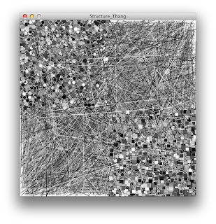
I have finished my experimentation of noise versus structure and narrowed it down to 8 images which I believe best show my findings. I have chosen a range of images from my experiments, and I have mainly chosen images which I believe show the boundary between structure and noise. 

Creative Coding, Project Two, Blog Six

Original Noise
I have now experimented with putting the noise I created (as shown in the image above) into a circular, 'target' looking structure. I took the randomly placed shapes and lines and put them into an area a certain radius away from the centre point and not exceeding a certain radius. I also used different shades for each different shape and for lines to further highlight the structure.

 After creating this structure out of noise, I looked at deconstructing it back into noise, by allowing the shapes and lines to exceed their boundary creating overlap and noise the more I allowed it to 'spill'.


I think this is the tipping point of where it goes from structure to noise, you can only just see a vague  ring of darkness other than the dark spot in the middle.

This is mainly just noise, only a black spot visible in the middle.

Thursday, 26 April 2012

Creative Coding, Project Two, Blog Five

Original noise image
I have been experimenting with creating form from my original noise image being the image above. What I have mainly been doing with this noise is splitting the different shapes (rectangles and circles) and lines into separate sections/squares. I have first started off by splitting the squares into one corner and the circles in another. As shown in the images below...

This result shows the noise is in a slight structure, even though the squares and circles are randomly placed amongst each other., they are still limited to a certain area.

Here I also put the random lines into separate corners, creating a structured grid, even though the shapes/lines are randomly placed with in each corner creating 'noisy' quarters, the contrast between corners creates structure as a whole.

Here I have used brightness to further contrast the quarters , making a more visually structured image, this almost looks like a 'dirty' section of a chessboard.

For this image I took my noise and put it in the 'pattern maker'(code which takes your coded image and repeats  it as small as big as you chose on the screen). Here I took two different images one of lines, the other circles, and coded it so it would randomly chose one or the other to repeat using an if statement. I found this image to still be fairly 'noisy' as it randomly places one or the other, however there is still structure to it as you can see the grid formation due to the evenly placed squares.

Here I extended from the last image, using more images for the pattern maker to chose to repeat, I also used different shades. In doing this greater contrast has been created, and it also further defines a grid showing more structure.

Going off the previous image, here I have decreases the number of lines and shapes per square/image. I found that this results in a loss of structure as it is less easy to see defined squares of a grid.

Again the more I decrease the amount of lines/shapes per square the more the structure becomes noise. 

Here I have used less contrasting shades for each of the squares resulting in less defined structure as it is harder  to see different squares and thus a grid.

Here I have added an extra square, being the lighter randomly placed line squares. I believe this has further defined structure due to the contrast created by its lighter shade than the other squares, making a more defined grid.

Going on from the previous image, here I have made the squares bigger.  I think this defines the structure of the grid more as up close you can clearly see the separate squares, however, seeing the squares bigger you notice the noise within each square.


Going off the previous image, here I have made the grid smaller. I believe this makes the image significantly more noisy as it is harder to see a grid pattern as many of the squares seem to blend together.

Here I have significantly reduced the square size creating an unrecognisable structure (noise). Being so small the squares almost blend into one shade of grey.


Here I have increased the size of the squares and circles within the squares. I think this has made the overall image less structured as it makes it harder to define each square as the shapes within them don't really blend together as much creating very different looking squares, and thus noise.

I found when increasing the size of the image squares as well as the shapes the counter act each other meaning no structure is really lost or gained.

Here I have grossly increased the size of the shapes within the squares, this definitely removes a lot of structure from the image as the grid is almost completely lost.
 The plan now is to experiment with creating structure within each square. I am then going to take a break from the grid and look at randomly placing these lines and shapes within circular patterns to find structure.

Sunday, 22 April 2012

Creative Coding, Project Two, Blog Four

I have now started trying to create structure out of the noise I created, here's what I have so far...
Here is the noise I created. As you can see there is no visible structure.

Here I have moved the 'scribbly' lines into one corner...

...now two corners...

...now the image is divided into four sections creating a sort of structure.

The plan now is to create a zoomed out grid with squares of lines and shapes to find a more distinct structure.

Friday, 20 April 2012

Creative Coding, Project Two, Blog Three

I have now started trying to find a structure I can manipulate and test to explore structure versus noise. In doing so I played around with loops using this 'while' command which lets me tell the computer how  many times I want it to draw what I tell it to draw. 

At the moment I've just started pretty basic, but I have been lots of fun using the 'random' command which chooses random values for what ever you tell it to such as co-ordinates, dimensions and colours. So far I have mainly created noise more than any structure...


Antiques Hunter

(Trade me, 2012)

This dish resembles the Rococo design style of the 18th century. It reflects the "feminine look"(Naturalistic Spoon, 2009) that influenced the Rococo style. This being the curved outer structure which curves reflect that of the female figure, it also uses feminine colours such as pink and white, which are used in a lot of Rococo design. In addition the ornamental roses are related with femininity and intimacy, just as the Rococo style is.

Rococo design also incorporated chinoiserie. This is shown in this dish as it is made from porcelain which is a Chinese material that began being imported and used in European design in the 17th century.

Fig 1: (Naturalistic Spoon, 2009)


Another Rococo design feature this dish has is protruding ornament. This feature was common to Rococo design as often ornament was applied which protruded the object. This is shown in Fig 1 as the applied silver decoration is not two dimensional creating textured decoration which protrudes the the main object structure. This feature made Rococo design irrational, and un-practical to use due to the irregular structures created. The dish reflects this as it has a porcelain rose attached to the rim,  taking away practical value as a dish and giving it more decorative value.

This bowl would have been designed for the higher class as it is exuberant and prestigious as Rococo design is. Rococo was established in a time of "internal peace and growing prosperity" (Hunter-Stiebel, Lupton, Davidson, Coffin2008) and this is reflected by its 'over-the-top' appearance. Again this bowl reflects this as it is covered with exuberant details such as the painted gold lines, the curvy shape etc. Thus this bowl is designed for the higher class as it is an example of 18th century Rococo design.

Bibliography:

Trade Me. (2012). Fancy German china flower dish. Retrieved from http://www.trademe.co.nz/antiques-collectables/ornaments-figurines/other/auction-466463961.htm

Naturalistic Spoon. (2009). Rococo Style. Retrieved from http://naturalisticspoon.com/Rococo_Style.html

Hunter-Stiebel, P., Lupton, E., Davidson, G. S., Coffin, S. D. (2008). Rococo: The Continuing Curve, 1730-2008. New York, NY: Editions Assouline.

Adrienne Chinn. (2012). Rococo Style. Retrieved from
http://www.adriennechinn.co.uk/interior-design-styles/rococo.htm

AskDefine. (2012). Chinoiserie. Retrieved from
http://chinoiserie.askdefine.com/